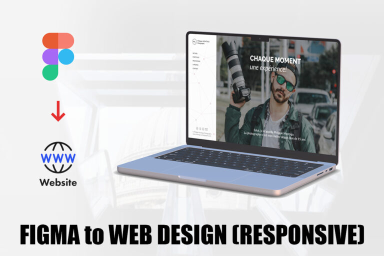
Full user flow video web version (no narration):
Full user flow video responsive version (no narration):
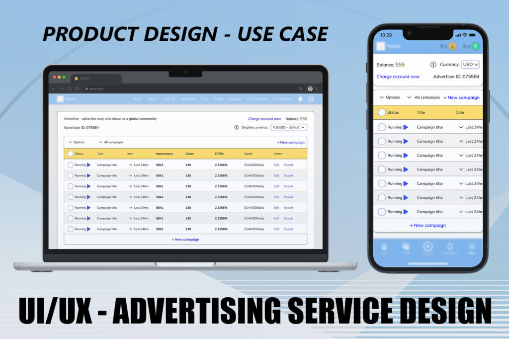
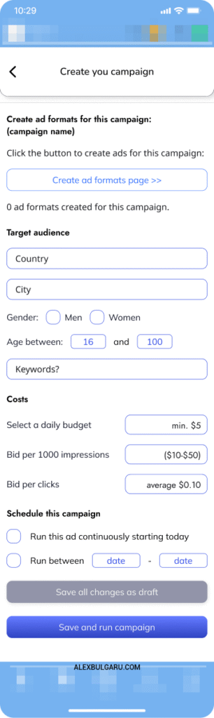
Responsive/mobile differences and app design for the advertising service.
Quick Use Case Navigation:
II.Ideation and Design process or III.Design iterations or Mobile/Desktop final video presentation
I.RESEARCH
1.Brief – Designing an internal ad system that reduces spam, supports users, and opens up a new revenue stream.
As the platform grew, more users began using their posts to share external links, often in spammy ways. This threatened the quality of the content and overall user experience. To fix this, I proposed an internal advertising system, directly connected to user accounts and easy enough for anyone to use. For a small fee, users could now promote posts properly, while spam gets reduced and the platform gains a revenue stream.
But just adding ads wasn’t enough. On a platform that never had them, they could feel intrusive or get ignored. So I made them blend in – ads that look like posts, shown rarely and placed naturally in the content flow. This kept the UX intact while allowing monetization.
After researching how ad systems typically work, I mapped out a simple MVP that’s functional from day one but designed to scale later. The core features include a campaign dashboard, an ad creation flow, a payment section, and a flexible structure that lets users build multiple ad formats under one campaign.
2.Key Features:
- Campaign Creation Flow – set goals, audience, budget, and default ad URLs;
- Campaign Dashboard – monitor ad performance, CTR, and budget in real-time;
- Ad Designer – create multiple ad formats (square, portrait, etc.) with preview;
- Top-up System – manage payment and credits;
3.What Marketers Look For
Each campaign tracks the essential metrics advertisers expect:
- Impressions – how many times an ad was displayed;
- Clicks – direct interactions with the ad;
- CTR (Click-Through Rate) – the key performance metric; above 2% is considered very good.
4.Campaigns vs. Ads
Campaigns are containers for promotions. Within each, users can create different ad types to test formats or optimize for different screens. This keeps performance data clean and helps both the user and the platform scale smarter.
5.The outcome
This system doesn’t just reduce spam, but it opens up a clean, scalable way for users to promote content and for the business to earn revenue, all while keeping the user experience intact.
In other words: gaining real exposure for a small fee which is a win-win for both the platform and the users. Spam is reduced, while revenue and post visibility are preserved.
II.IDEATION AND DESIGN
6.Building an ad system that fits naturally into the platform’s existing user experience.
When thinking about how to introduce ads, my priority was to respect the flow of the platform. Since the site is built around user-generated posts, both on desktop and mobile, it made sense to design ads that looked and behaved like posts and not banners or popups.
Instead of placing ads across pages or sidebars, I integrated them directly into the post feed. The ads match the style and format of regular content, making them feel like a natural part of the experience. This reduces disruption and helps users stay engaged with the platform.
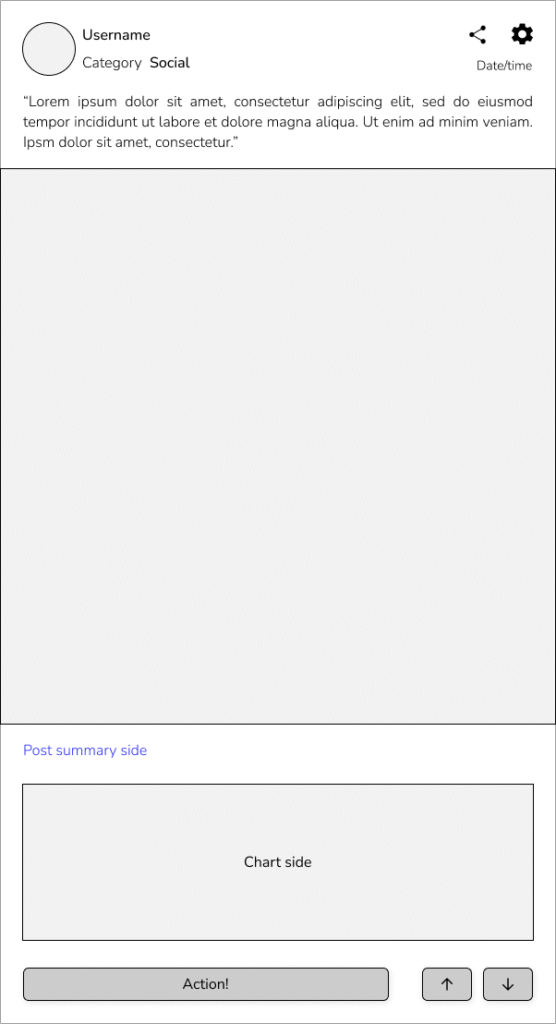
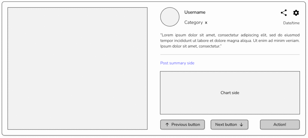
The website’s social posts look like this:
How the ads are displayed
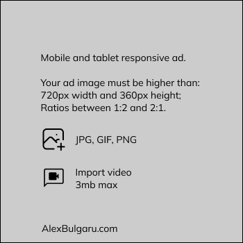
I created four responsive ad formats, each aligned with the platform’s post layout:
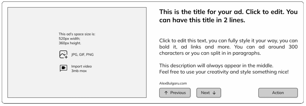
- Web format – Graphic + Text: Looks like a standard post with visual and caption;
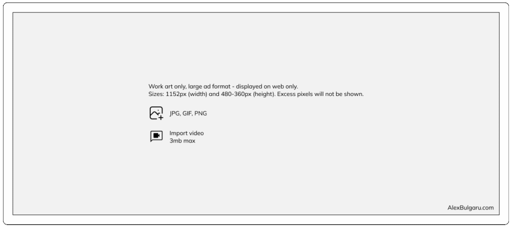
- Web format – Full-Graphic: A bold visual-only ad for stronger impact;
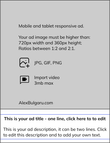
- Mobile format – Graphic + Text: Optimized for small screens with post-like layout;
- Mobile format – Full-Graphic: A fullscreen visual for mobile ad slots.
This flexible setup allows users to promote content across devices without breaking consistency. The ads blend in visually while still standing out just enough to attract attention.
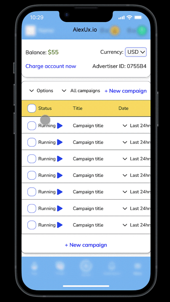
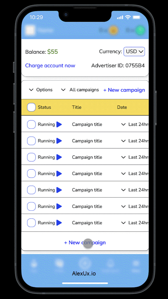
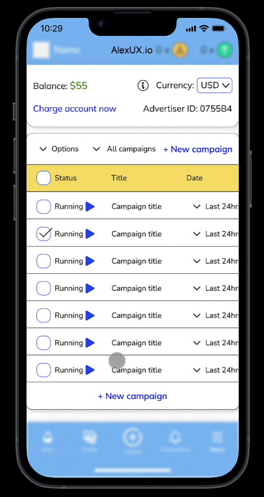
7.Helping users track performance in real time on any device.
To give advertisers full visibility and control, I designed a campaign dashboard that works seamlessly on both desktop and mobile. The layout keeps things simple, showing everything users need at a glance, like campaign status, performance metrics, and budget info.
Each campaign card shows the basics: whether it’s running or paused, how many impressions and clicks it’s getting, the CTR %, and how the daily budget is progressing. Users can jump in to edit or manage any campaign right away.
Design Approach
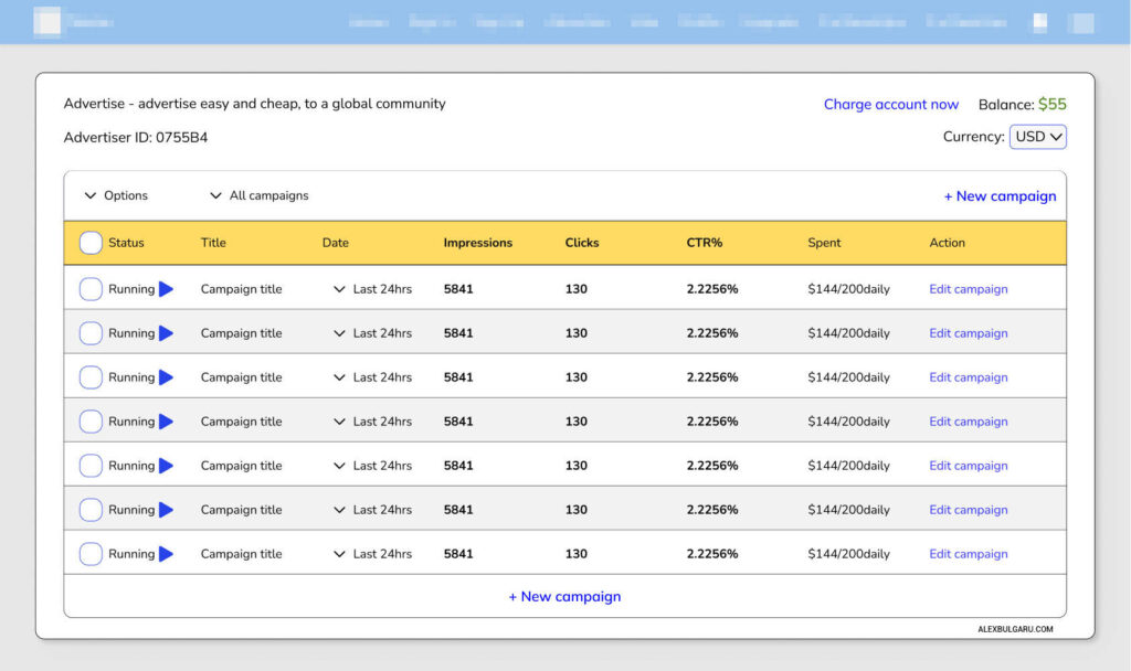
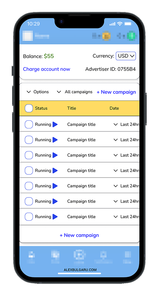
For mobile, I kept the same table logic but redesigned the layout slightly to allow horizontal scrolling instead of forcing a stacked view. This keeps the structure consistent while making it easy to scroll through data, even on a smaller screen.
Whether they’re managing campaigns on a laptop or on the go, users get the same fast, reliable access to their advertising performance.


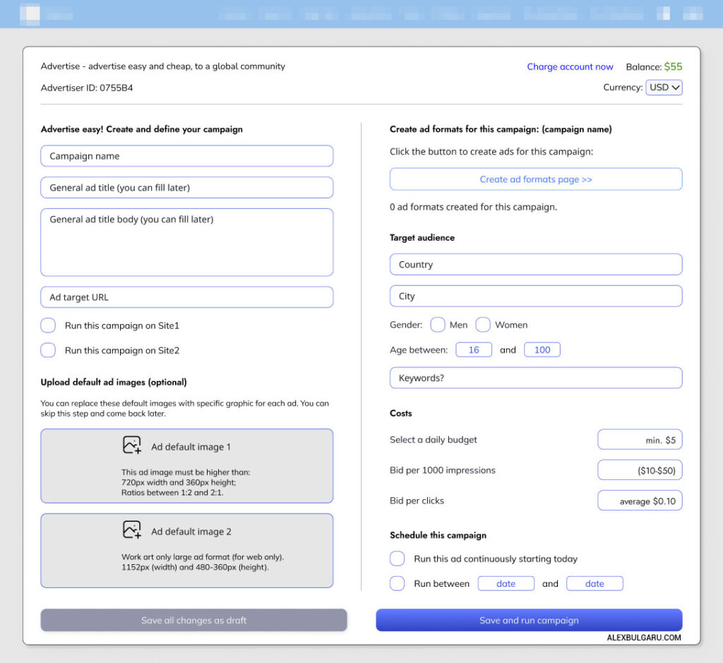
8.Campaign creation page
Designed for quick setup, flexible use, and mobile convenience.
The campaign creation flow had to work for both experienced marketers and everyday users, especially those managing ads from mobile. I focused on making it fast to set up, yet flexible enough to support more advanced strategies.
Users can name their campaign, write a short ad title and description, and add a default target URL (helpful when long, tracked links are reused across ads). For platforms that will host multiple websites in the future, I also added site selection, so advertisers can choose exactly where their ads appear. This keeps things clean and scalable as the platform expands.
To simplify the process even further, especially for mobile users, I introduced an option to upload up to two default images per campaign. These can be used to prefill ad formats, which is handy when custom graphics aren’t readily available or consistent branding is needed across different ad shapes.
Campaigns can be saved as drafts or launched immediately, depending on the user’s workflow.
This layout strikes the balance between speed, control, and scalability, empowering both casual users and marketers to build effective campaigns, even across multiple properties.
9.Ad Design Interface
The Ad Design Interface is where users create the actual ads tied to their campaign. Whether they’re on desktop or mobile, the experience adapts to their workflow, making ad creation feel lightweight, even when managing multiple formats.
a) Mobile experience
On mobile, I designed a step-by-step flow that prompts the user to fill in missing formats, upload or reuse default visuals, and preview each ad instantly. It’s all touch-friendly and keeps users updated on progress as they go.
(Check out the demo GIF or the video walkthrough available.)
b) Desktop Experience (Video Walkthrough)
On desktop, the interface expands to give more creative freedom. Users can drag and drop files, adjust overlays in real time, and organize everything in a structured grid. It’s built for speed, especially when creating multiple formats at once.
To avoid friction, I added a Smart Prefill system, if no custom visuals are uploaded, the platform automatically fills each format with:
- A default image (if one was uploaded during campaign setup):
- The campaign title and target URL.
This ensures that no ad is left incomplete and helps users publish quickly, even when working with minimal assets.
III.Design iterations
10.Turning a good system into a flexible, SaaS-level experience.
After the initial MVP, I kept refining the advertising service by adding features that make it faster, clearer, and more valuable, both for users and for the business. These iterations were based on real use cases, user convenience, and giving advertisers full control over their campaigns.
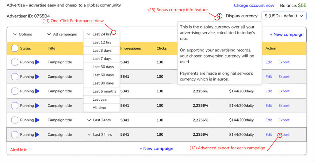
11.One-Click Performance View
I added a global “Last 24h” toggle on the dashboard, so users can instantly see recent results across all campaigns, without having to click into each one. It reduces repetition and gives a faster overview at a glance.
12.Advanced Export Options
For professional users, I created an Export Panel for each campaign. They can:
- Choose which records to export and for which dates;
- Select how the data is arranged (vertical or horizontal);
- Pick the file format: CSV, XLSX, PDF, or JSON.
(Check out the demo GIF or the video walkthrough available.)
This level of control is expected in serious SaaS tools and it gives advertisers complete ownership of their campaign data.
13.Smarter Campaign Setup
On the campaign creation page, I added:
- A reach estimation tool (how many users could see the ad);
- A hybrid payment model, where users can choose how to pay (CPC, CPM, or a mix);
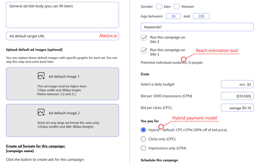
This lets each campaign adapt to the advertiser’s strategy, whether they want impressions, clicks, or a balance of both.
14.UX Enhancements
I included:
- A “Advertisement” label on ad posts, to ensure transparency for the user and maintain trust in the platform;
- A small info button next to the display currency, to explain what it is.
15.Bonus Feature: Promote Your Post
As a bonus, I designed a shortcut inside regular posts: “Promote this post”. With one click, it turns the post into an ad and creates a new campaign. This gives every user, not just marketers, the chance to experience the ad system, and see the results.
16.Final Outcome and the Conclusion
With these additions, the ad service evolved into a flexible, SaaS-like platform. It’s easy for beginners, but powerful enough for professionals. Users have full control over their campaigns, from setup to export and they can manage everything from desktop or mobile.
And the best part? The platform generates new revenue for the company without sacrificing user trust. It’s a clean, respectful system that brings value to everyone. A real win–win!
Final product video presentation
Thank you!